By Lloyd Alter 2022 Treehugger
“We don’t love something because it is non-toxic and biodegradable, we love it because it moves the head and heart. When we treasure something, we’re less prone to kill it, so desire fuels preservation. Love it or lose it. In this sense, the old mantra could be replaced by a new one: If it’s not beautiful, it’s not sustainable. Aesthetic attraction is not a superficial concern, it’s an environmental imperative. Beauty could save the planet.”
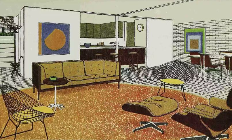
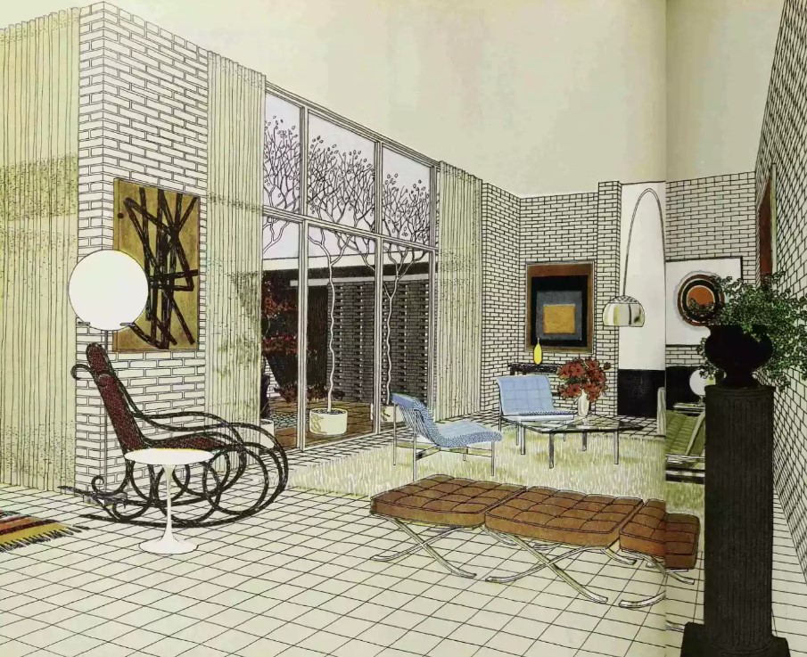
The family room had a classic Eames Lounge chair that is still in production—in fact, almost every piece of furniture shown is still in production—and a pair of Bertoia diamond chairs all perched on an orange shag rug, with a Josef Albers on the wall. I was intrigued by the kitchen, which was both open and separate, and the brick interior walls, and decided to dig further.
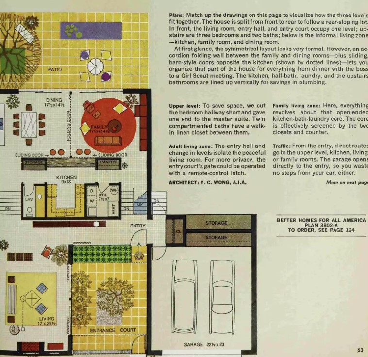
The house plan is credited to an architect named Y.C. Wong, AIA. According to his obit in the Chicago Tribune, published in 2000, he was “an exacting Chicago architect noted for the atriums that characterized his designs.” He worked for modernist greats like Skidmore, Owings and Merrill, and CF Murphy (later Murphy Yahn).
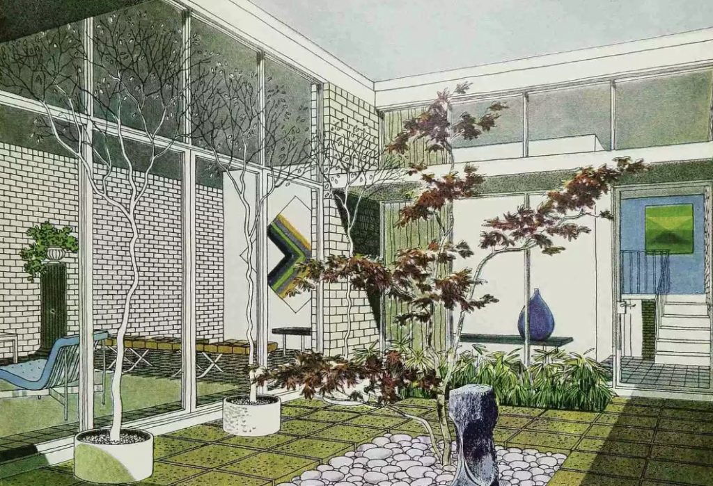
“He was a pupil of Ludwig Mies van der Rohe and carefully employed the precision and directness characterized by the second Chicago School. The homes he designed followed simple abstract forms and typically featured space for a garden in an inward-facing, glass-walled atrium.”
You see all of that in this 1968 house and more. The wonderful thing about house plans designed for magazines is that architects don’t have to worry about a particular client or site; they can design what they think is the best possible house. And there is a lot to love about this one.
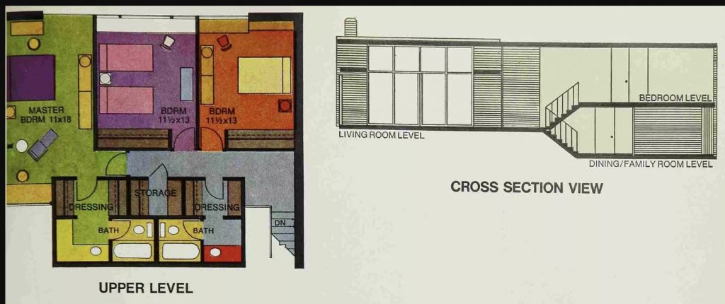
Note how the walls are brick. Wong built a lot of his houses with commercial technology; here, we have a cavity wall with insulation in between two rows of brick. The ceiling/roof is made of precast concrete. Embodied carbon wasn’t a thing in 1968, and it is certainly going to be solid and low-maintenance. According to BHG, the architect has built a few of these, and “he reports it results in substantial cost savings.” Floors are sealed quarry tile.
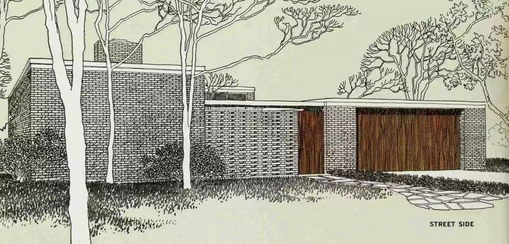
Things have certainly changed in half a century. The atrium entry might seem like a security issue to some, the living room might seem superfluous, the garage on the side requires a lot of real estate and I doubt the concrete and brick would be cost-efficient today. But I suspect it would still be a joy to live in, the furniture might be worth more than the house, and it will all last forever—that is sustainable design. And that kitchen plan is definitely worth looking at again.
